Selected work / 2018-present
Avery Anderson
Creative strategist building brand, content, and audience-growth systems.
Agency leadership, YouTube growth, small-business marketing, and brand architecture.
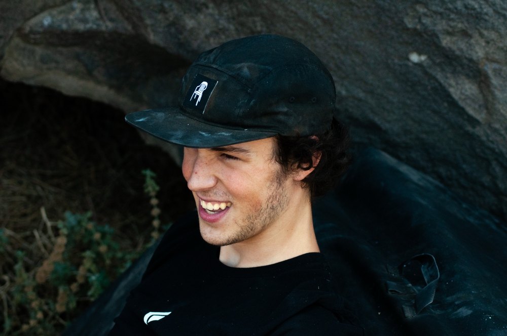
Creative point of view
Make people care. Then give them something to do.
I work where strategy, writing, visual communication, and audience behavior overlap. The through-line is simple: find the human truth, build a clear creative system around it, and keep learning from what the audience actually does.
Fast systems
Go fast, fail fast, pivot fast. Package the work, test the signal, move attention across platforms, and turn performance into the next creative decision.
Deep systems
Slow down, understand every brand decision, align the people involved, and build a system that can hold meaning for students, parents, partners, and funders.
Full case study / One Stone Studios + Labs
Turning a confusing ecosystem into a usable brand architecture.
One Stone's mission was clear internally: make students better leaders and make the world a better place. Externally, the organization had grown from service work into camps, a non-traditional high school, and multiple student-driven programs. The harder question became simple: what does One Stone actually do, and how do you make a community understand it in one night?
Context
One Stone began as an after-school service program, expanded into summer camps, and eventually opened a non-traditional high school. Each branch made sense on its own, but the whole system was hard for students, parents, partners, and supporters to understand quickly.
Problem
If people could not understand the ecosystem, students were less likely to participate, parents had less reason to trust it, and community partners had a harder time knowing how to use or support the organization.
Insight
Instead of explaining One Stone as disconnected branches, the team reframed it as one large science lab for student leadership, with themed spaces where students could experiment, build skills, and serve the community.
Public rollout
The new brands and full ecosystem were introduced publicly at The One Event through live talks, video assets, donor-facing storytelling, and a room built to make the model feel understandable and worth supporting.
The system
Programs became themed labs.
The themes focused on areas traditional high schools often fail to make tangible: making, art, technology skills, and becoming a good human. The system had to honor One Stone's existing block-based visual tradition while staying accessible to students, parents, partners, and donors.
Avery co-directed the brand architecture work, helped develop the lab themes, designed the lab logos, built the strategic justification behind the rollout, briefed the board, and supported the event assets that turned the new ecosystem into a public story.
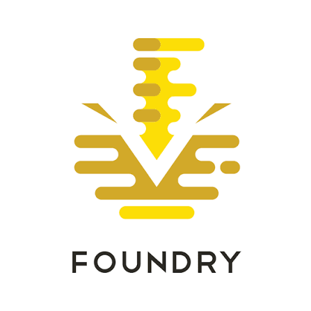
Foundry
Shop, making, and hands-on building.
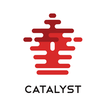
Catalyst
Art, creativity, and visual expression.
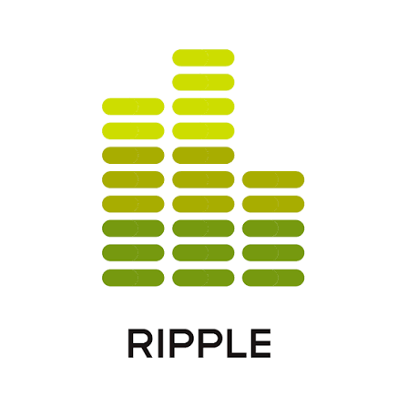
Ripple
Community impact and service energy.
Case-study note: this was a major collaborative rollout with many hands involved. This page focuses on Avery's co-directing role, theme development, logo design, strategic justification, board-facing explanation, and event-support assets for The One Event launch.
Full case study / DangerTV
Building a repeatable click-through and cross-platform growth loop.
DangerTV did not bring Avery in to solve a single broken campaign. The mandate was broader: improve click-through engagement, connect TikTok attention to YouTube behavior, and present performance data clearly enough to support advertising and partner conversations around a 24-hour channel.
The point was not one viral post. The work turned packaging, testing, platform movement, and partner-facing reporting into a repeatable growth system.
TikTok clips opened loops quickly and created curiosity around the story.
The edit ended before resolution, making the next click feel necessary.
Viewers were pushed toward the YouTube page or the next part of the sequence.
Packaging, timing, and follow-up creative turned curiosity into measurable traffic.
Operating discipline
Creative choices were treated as tests.
Avery tested thumbnails through A/B comparisons and made quick creative decisions once a meaningful performance gap appeared. When a thumbnail showed a roughly 15% difference, the weaker option was dropped to avoid diluting attention between variants.
The work combined color theory, viewer psychology, thumbnail design, short-form pacing, titles, tags, release timing, and analytics. It also required production fluency: working with brands and platform partners like Samsung to confirm ad dimensions, promotional specs, and deliverables for connected TV and channel promotion.
The goal was not just getting clicks. It was getting the right audience behavior, then turning that behavior into better campaign, ad-sales, and partner decisions.
Evidence artifacts
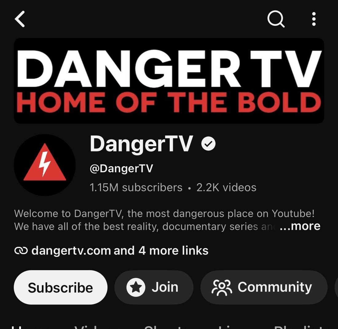
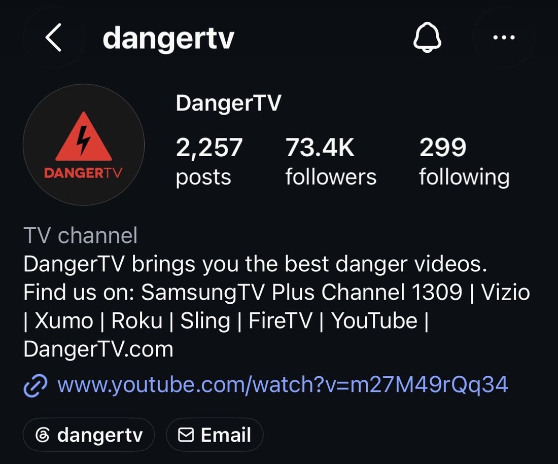
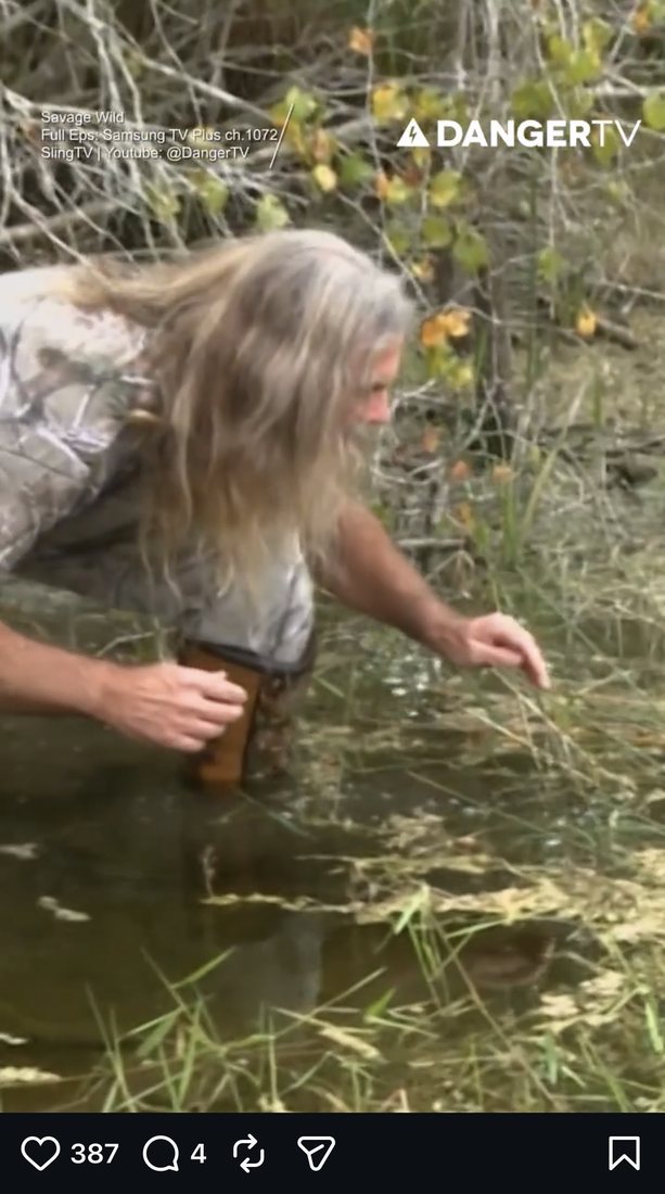
Public screenshots show the scale and channel context.
These screenshots document public-facing channel footprint and examples from content where Avery controlled or influenced strategy. They are included as contextual proof, not as a claim of ownership over underlying show footage.

Thumbnail A
+15%
Keep the stronger hook once performance separates.
Thumbnail B
Drop
Remove weaker variants before views split across underperforming creative.
Decision rule
Move quickly without guessing blindly.
The value was not one perfect thumbnail. The value was a repeatable system for packaging content, reading the signal, dropping weak creative quickly, and improving the next release while the attention window was still open.
Monetization context
Audience growth supported the 24-hour channel.
The growth work fed a larger business model: content sellers paid to place shows on the 24-hour channel, while ad companies paid for ad inventory. Avery's role included coordinating with company partners, presenting metrics, confirming creative specs, and helping frame what ad slots were worth.
Content sellers
24-hour channel
Audience data
Ad inventory
Partner contracts
Case-study note: original analytics access is no longer available. Metrics shown here are based on figures Avery was able to obtain from a former supervisor, public channel screenshots, and Avery's firsthand description of the operating system and partner-facing responsibilities. Screenshots are used as contextual evidence of public-facing work and channel scale.
Recent case study / Flipstar HVAC
Helping a small service company compete without acting corporate.
Flipstar started in a saturated HVAC market where bigger companies could outspend, outstaff, and out-advertise a small local operator. The opportunity was not to build a complicated marketing machine. It was to make the service experience simple, human, reliable, and easy to remember.
Core idea
Win on service, clarity, and repeatable systems.
The brand position was built around clean energy, saving people money, and making HVAC feel less overwhelming. The system stayed intentionally simple: direct communication, memorable print touchpoints like magnets, clear service expectations, and relationship-driven outreach to homeowners and property managers.
The work asked a practical brand question: how does a small HVAC company earn trust in a crowded market without pretending to be a giant? The answer was to feel family-owned, easy to reach, and useful every time someone interacted with the company.
Use a clear maintenance offer to turn emergency-only calls into predictable yearly relationships.
Target high-leverage relationships where one trusted vendor can serve multiple units and reduce tenant friction.
Use magnets, follow-up, referral prompts, and simple reminders so the brand is easy to recall when service is needed.
Case-study note: this section is framed as a retrospective brand and service-system case. Metrics are approximate and based on Avery's reported context from the business: roughly $400K in year-one revenue with continuing monthly growth.
Selected case studies
Work that connects story, system, and signal.
Brand architecture + launch
One Stone Studios + Labs
Co-directed the naming, theme development, logo design, strategic justification, and public rollout for a lab-based brand architecture launched at The One Event.
- Reframed multiple branches as themed labs within one student leadership ecosystem.
- Designed lab logos while preserving One Stone's existing block-based visual language.
- Supported launch storytelling through live-event framing, video assets, and board-facing explanation.
- Helped present the new ecosystem at a sold-out event with 22 community supporters buying tables.
- Served on the board as brand liaison and developed a budget plan extending projected runway from 3 to 5 years.
Digital media / 2021-2023
DangerTV growth strategy
Built a repeatable loop across short TikTok cliffhangers, YouTube click-through strategy, thumbnail A/B testing, data presentation, and 24-hour channel advertising support.
+113% views
+410K TikTok followers
+38% ad revenue
Read full growth case
Mock brand system / Start to finish
Death Grip Chalk Co.
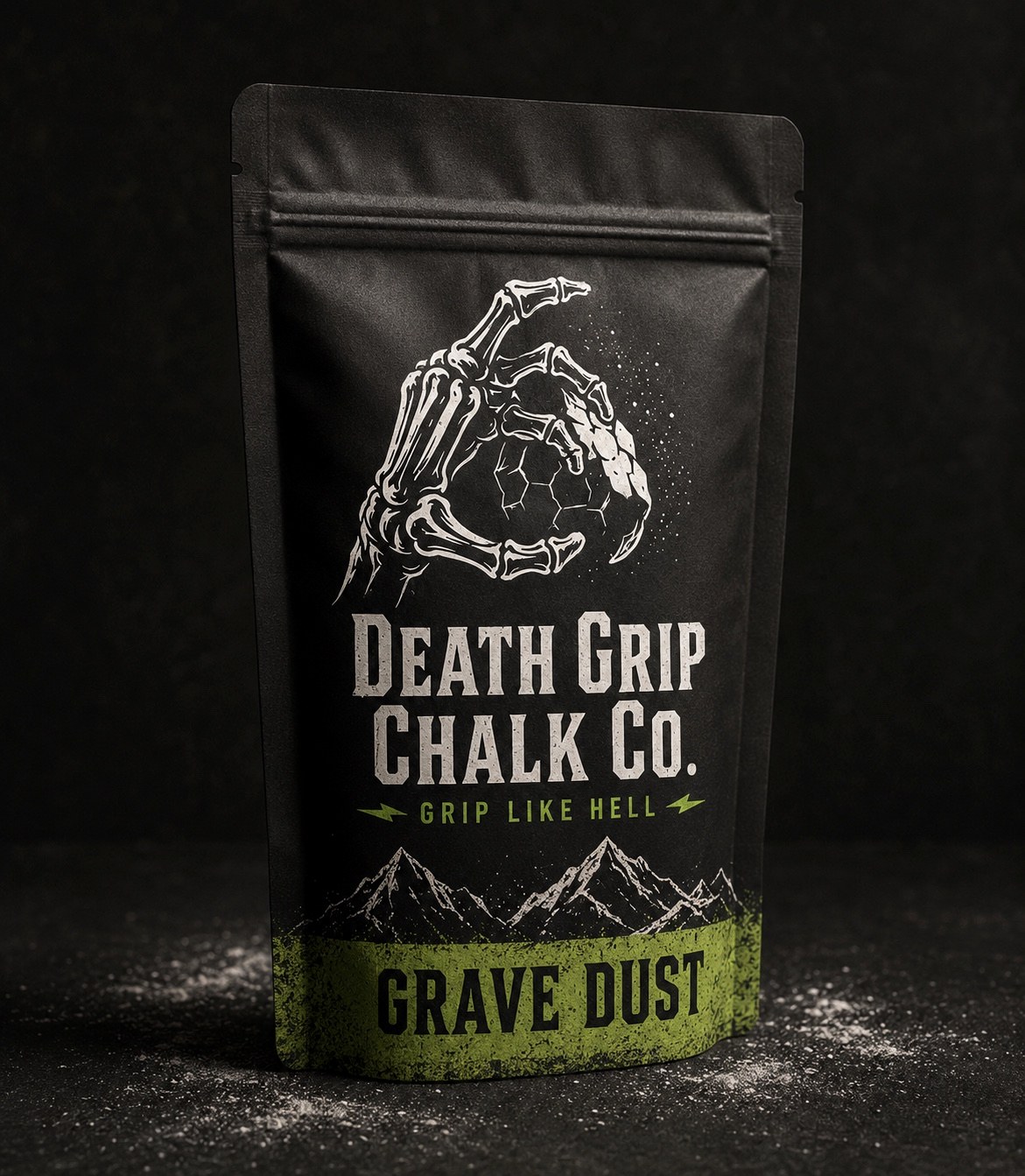
Built a punk climbing chalk brand from a rough skeleton-hand idea into a full identity world: logo directions, symbolic rationale, packaging architecture, social, and launch applications.
6+ logo directions
4 product variants
Launch system
View brand build
Small business growth / Recent
Flipstar HVAC service system
Helped shape a simple brand and service plan for a small HVAC company competing in a saturated market: clean energy, saving customers money, human service, property-manager relationships, and repeatable follow-up systems.
- Positioned the company around service, simplicity, and a family-owned local feel.
- Developed the service-plan, property-manager, magnet, referral, and follow-up logic as one practical growth system.
- Contributed to a growth system tied to roughly $400K in year-one revenue and continued monthly growth.
Small business growth is brand work when the experience is the marketing.
Community storytelling
FARE Idaho
The client needed a video series featuring restaurants and community leaders to explain the impact of Idaho's food network while promoting an event and partnership.
The solution used real footage, a trusted local voice, and community context instead of abstract institutional messaging.
Watch public video
$500K
Raised through related One Stone event campaign support during COVID
13+
Major donor relationships supported through campaign work
Values-led branding
Saalt
Helped oversee an early branding package for a reusable period-care company, with female leadership protected inside the creative team and a research process designed to make menstruation less taboo and more openly understood.
Brand work was not only visual. It required learning, language, audience sensitivity, and a creative process that matched the subject.
Independent film / Service prototype
Legacy film prototype
Produced a personal prototype for a service creating legacy videos for families who have lost loved ones. The test focused on pacing, interview experience, emotional weight, and how the process felt from the participant side.
Watch prototype
6:00
Interview-led documentary prototype
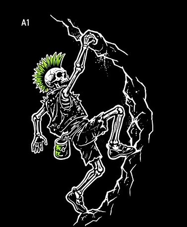
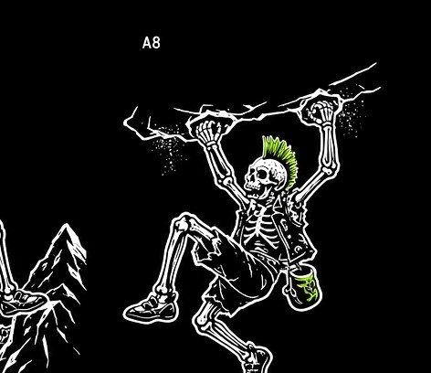
Mock case study / Death Grip Chalk Co.
A chalk brand with one hand on the wall and one foot in a punk venue.
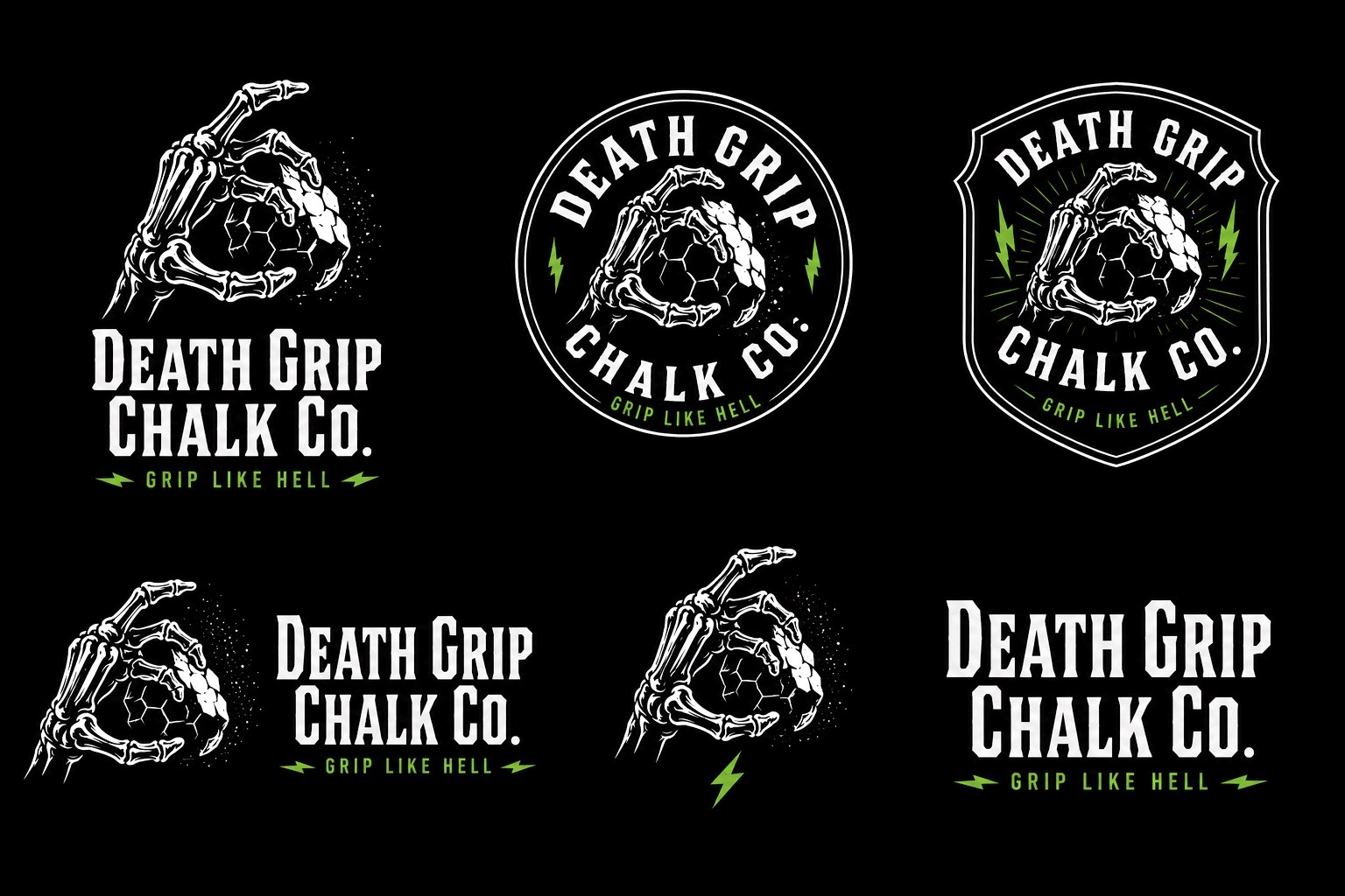
Death Grip started as a rough skeleton-hand logo for a fictional chalk company. The stronger idea underneath it was not horror. It was the ritual every climber knows: chalk up, commit, and hold on when the next move feels bad.
The brand was built around that tension: performance gear with the attitude of a band tee, a sticker-covered water bottle, and a joke your climbing buddy keeps repeating.
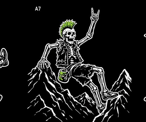
Grip like hell.
A climbing chalk brand for boulderers, gym climbers, and weekend dirtbags who want gear with more bite than the standard outdoor aisle.
Gear with band-tee attitude.
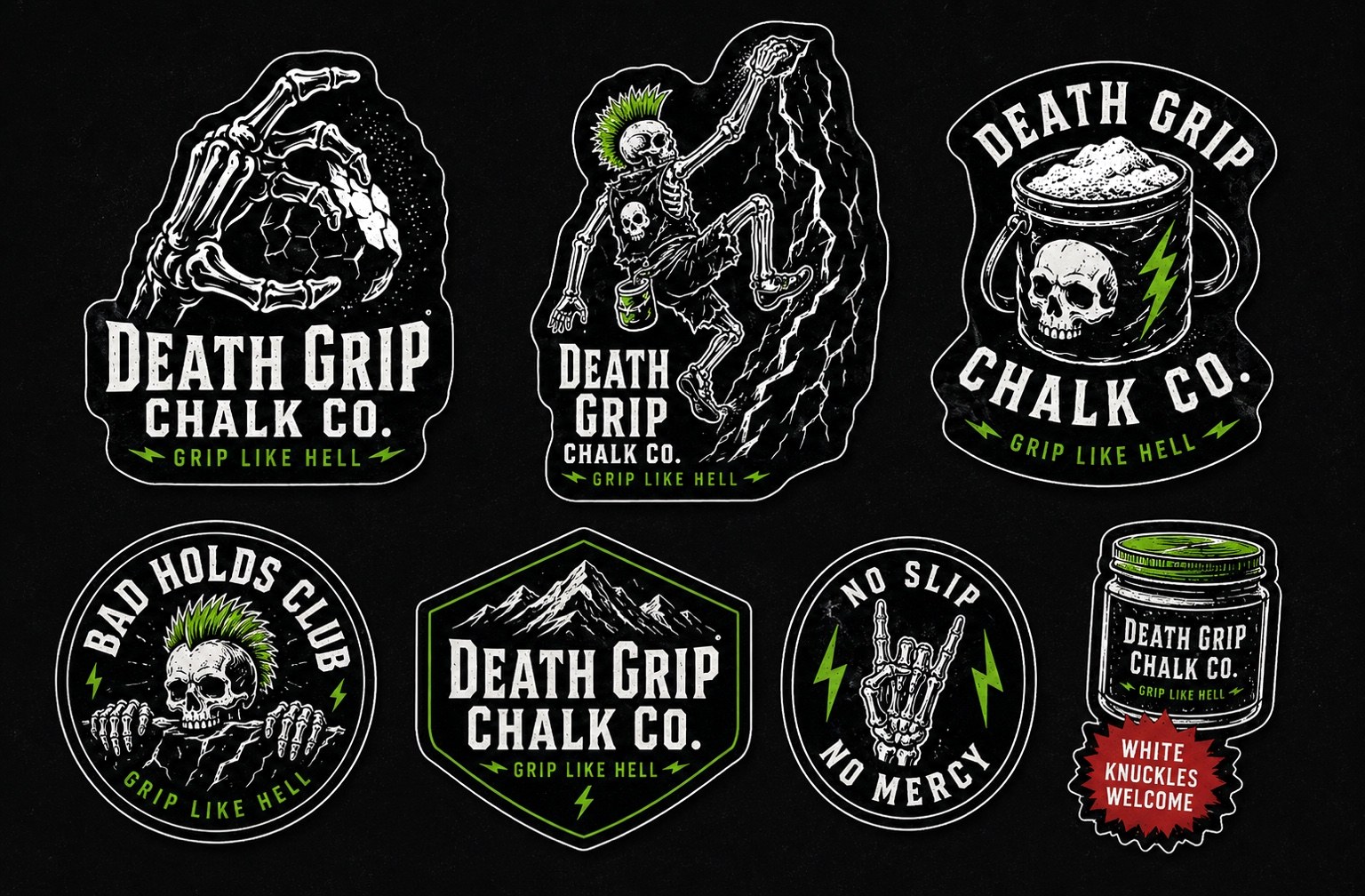
The brand needed to work first as packaging, then extend into stickers, shirts, chalk bags, patches, and gym-counter culture.
Punk, not precious.
The voice is dry, dark, and playful. It looks intense, but it is not trying to be scary. The wink is part of the system.
Symbolism
Every visual choice points back to climbing.
A literal death grip: tension, effort, scraped knuckles, and the final hold before a send.
The visible residue of effort. It keeps the brand tied to the actual product.
Outdoor climbing energy without becoming peaceful or soft.
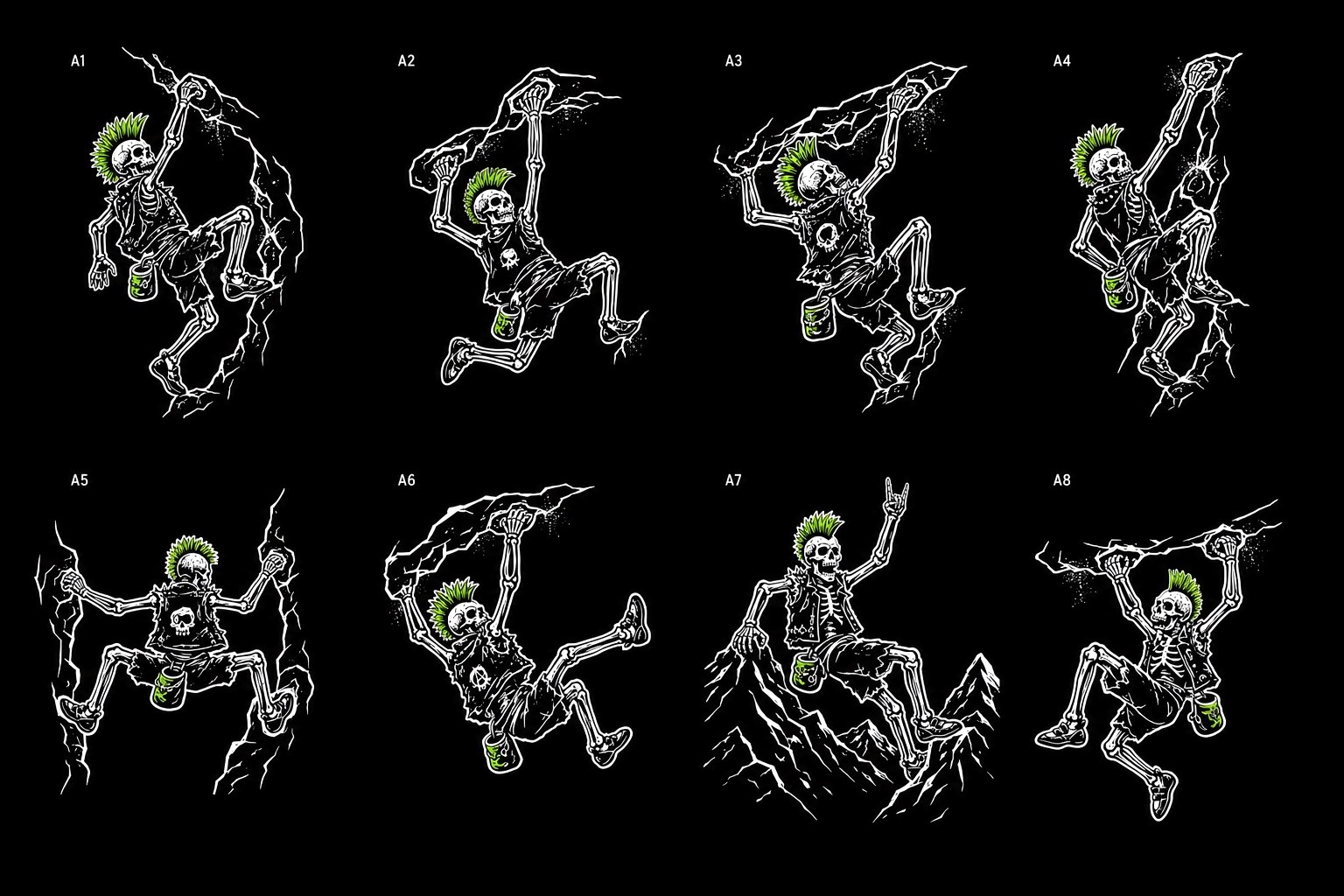
A punk character system that makes the brand funny, human, and extendable.
Rugged, physical, and a little outlaw, with more weight than clean startup typography.
Route tape, punk hair dye, lightning, and high-friction energy in one accent color.
Brand build process
From rough idea to working system.
Started with the existing skeleton-hand drawing and identified what had value: grip, humor, contrast, and subculture energy.
Built multiple lockups so the identity could flex across bags, badges, patches, social, and apparel.
Expanded the hand into skeleton climbers, jagged rock, chalk dust, and punk character assets.
Tested the system on packaging, stickers, a website hero, social posts, and field-ready accessories.
Brand world
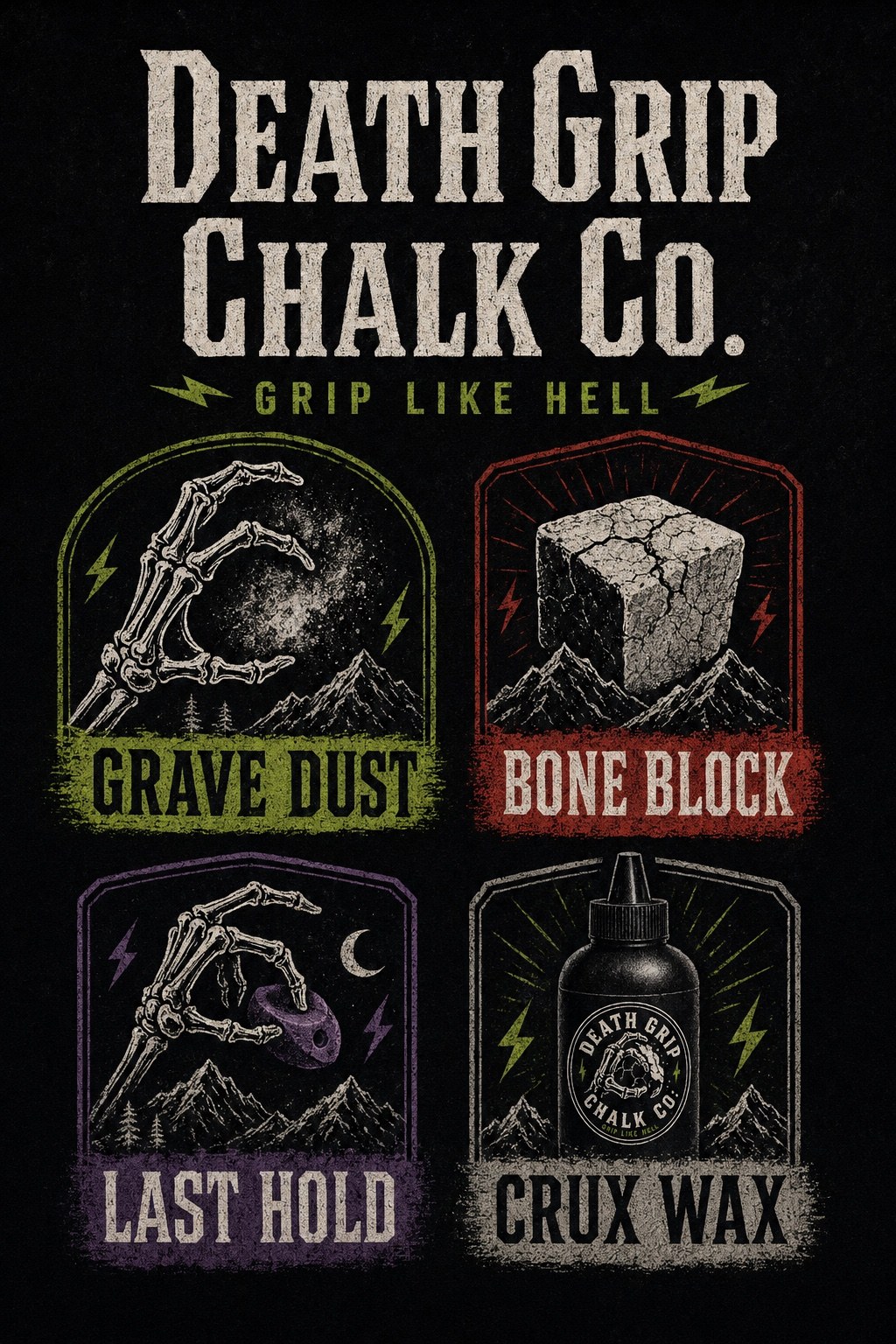
The product names became little pieces of climbing lore.
Grave Dust, Bone Block, Last Hold, and Crux Wax turn the line into something more memorable than “chalk bag, chalk block, liquid chalk.” They give the system a collectible, inside-joke quality that fits the punk climbing voice.
Portfolio proof
This project shows brand thinking beyond a single graphic.
The value of the exercise was building a full commercial world from one rough visual spark: audience, position, symbols, logo hierarchy, product architecture, packaging, voice, social, and application logic.
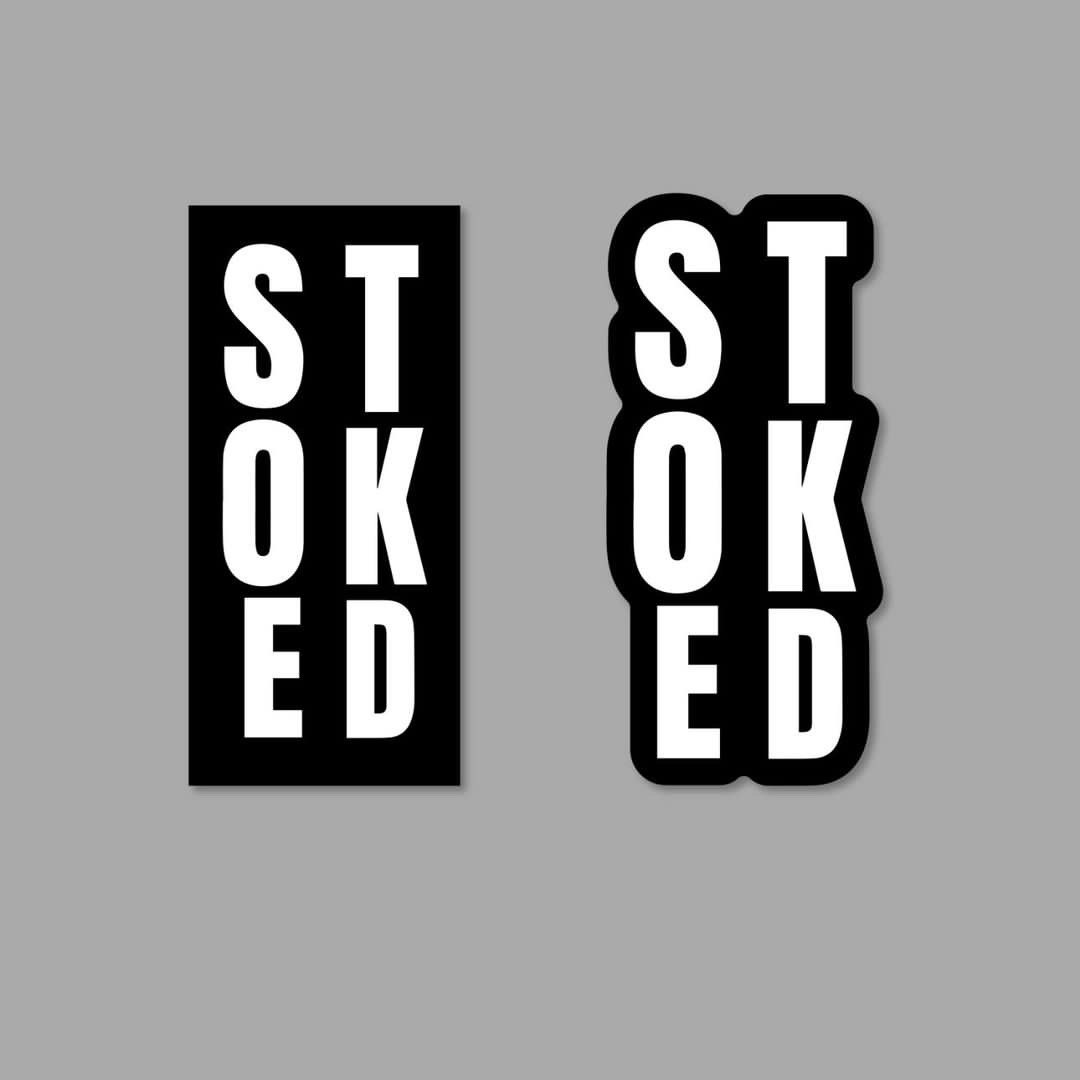
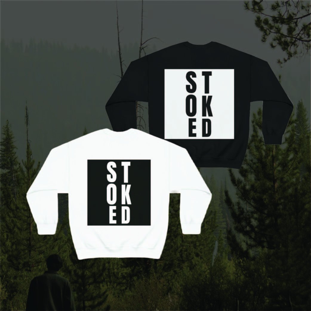
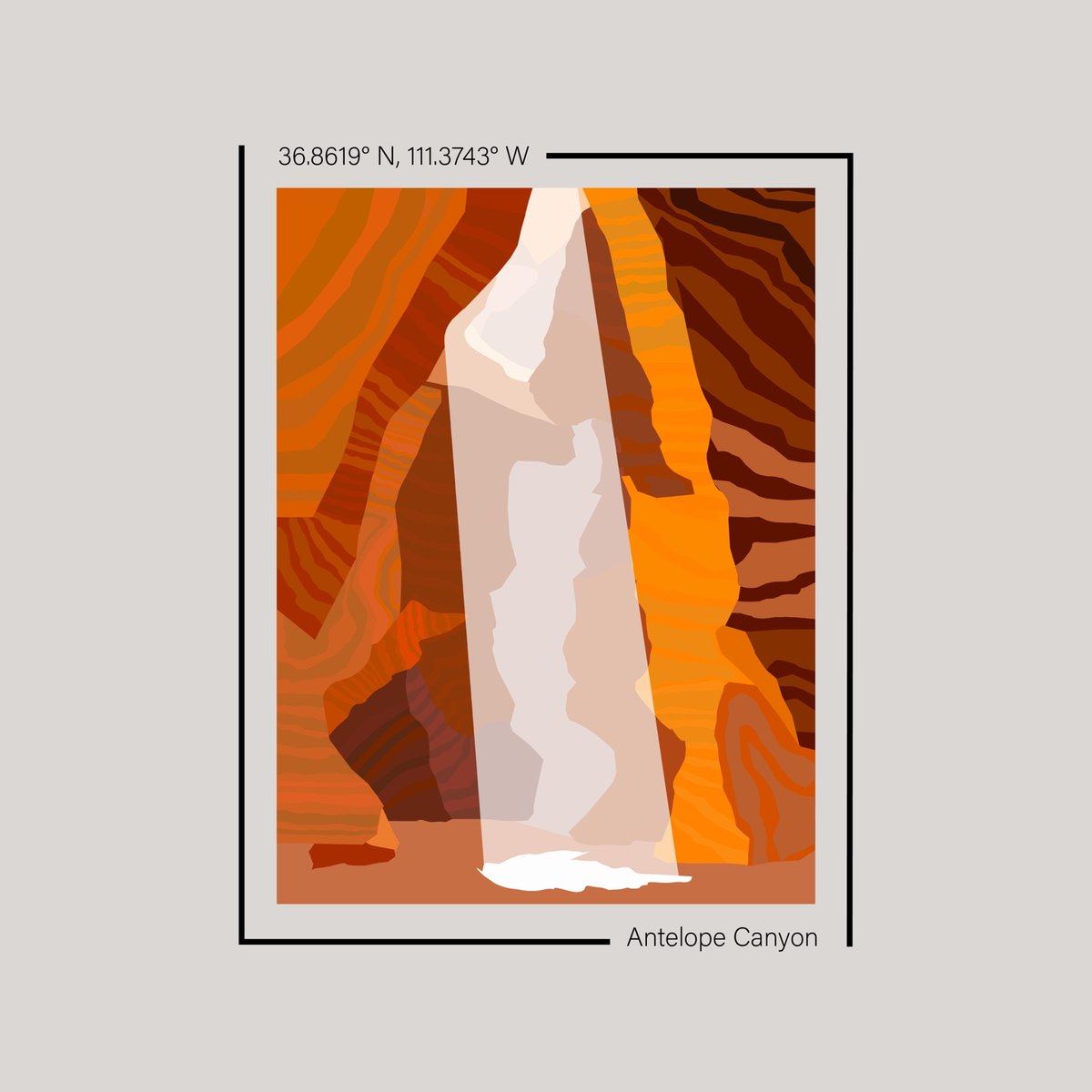
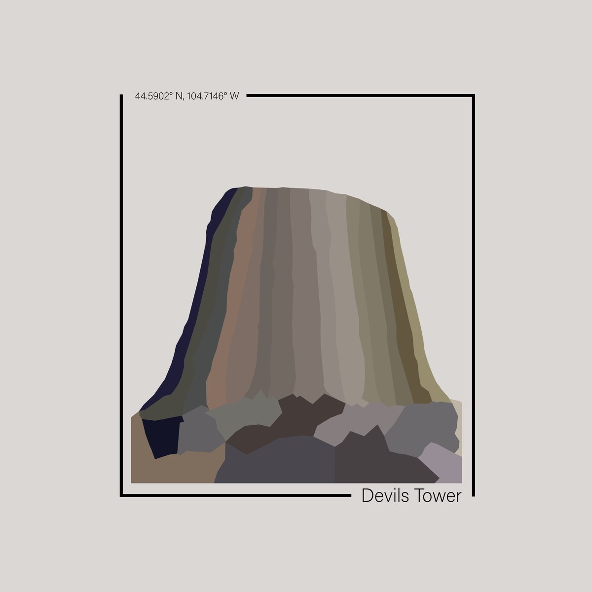
Visual exploration
Identity and image systems.
About
Creative operator, not just a maker.
I have worked inside student-led agency environments, digital media, nonprofit campaigns, brand systems, freelance projects, and high-pressure healthcare teams. That mix shaped how I work: listen hard, make the idea clear, execute cleanly, and pay attention to what actually happens after the work goes live.
Brand strategy
Content marketing
Campaign development
Visual storytelling
Audience analysis
Creative direction
Contact
Available for creative strategy, brand, content, and marketing roles.
Best fit: creative strategy, content strategy, brand marketing, social/content growth, and marketing coordinator roles.